It’s safe to say that eye-catching and scroll-stopping Amazon listings are crucial for capturing the attention of shoppers and boosting sales. But how do you do that if you don’t know much about graphic design? To help you optimize your Amazon listings, here are the top 21 Amazon graphic design tips you need to know to help elevate your product presentation and boost sales. Read the full article below.
First things first: Audit Your Amazon Listing
Before diving into our full list of Amazon graphic design tips, it’s important to understand what’s working and what isn’t. Audit your Amazon listing, from copywriting to SEO, Amazon graphics, and more, to fully understand where improvements must be made. Let’s dive into some of our top Amazon graphic design tips below.
Tip #1 Brand theme dominance with strategic pops of color
Embrace your brand theme, but introduce strategic pops of contrasting color to draw attention to key elements. This technique not only adds visual interest but also guides shoppers’ focus on specific product details.
Tip #2 Asymmetrical balance for increased visual interest
While balance is typically associated with symmetry, consider leveraging asymmetry for a more dynamic and visually interesting Amazon image design. Place elements off-center, but ensure that the overall layout maintains a sense of equilibrium.
Tip #3 Duotone magic
Experiment with duotone effects to infuse your Amazon graphics with a modern and stylish flair. Duotone involves using two contrasting colors to replace the traditional black and white. This technique can transform ordinary images into attention-grabbing and on-trend visuals. Always ensure your brand guide uses Duotone first.
Tip #4 Dynamic call-to-action (CTA) buttons in your Amazon storefront
Design attention-grabbing CTA buttons that prompt Amazon shoppers to take action directly in your Amazon storefront graphics. Use contrasting colors and compelling text to encourage clicks, leading potential customers to make a purchase.
Tip #5 Localized graphics for international markets
If you’re targeting international Amazon marketplaces, consider creating graphics that resonate with different cultures. This may include language-specific design elements or adaptations to appeal to regional preferences.
Tip #6 Stay Updated with design trends
Keep abreast of current design trends to ensure your Amazon graphics remain modern and visually appealing. Trends evolve, so periodic updates keep your listings fresh.
Tip #7 Optical elements for perception enhancement
Use visual elements to enhance the perceived value of your product. Clever design tricks can influence how customers perceive your product, making it appear more premium or spacious all while remaining true to your product offer.
Tip #8 Storytelling through visuals
Craft a visual narrative for your product. Tell a story through your Amazon graphics to resonate with customers, creating an emotional connection and making your product more memorable. Mention your mission and vision social causes, and more in the Amazon Brand Story.
Tip #9 Monitor competitor graphics
Regularly assess and analyze the graphics of your Amazon competitors. Identify successful design elements and incorporate them into your own strategy, while also ensuring your visuals are unique and stand out in the crowded marketplace.
Tip #10 High-quality photography matters but it shouldn’t break the bank
Ensure that your product photography is high resolution, clear, and showcases your product from multiple angles. Save money and Invest in UGC from reputable creators. You’ll be blown away by the results, and pleasantly surprised by the price tag.
Tip #11 Consistent branding and messaging is a must
Maintain a consistent visual identity across all your listings. This includes using the same color scheme, fonts, and logo to establish brand recognition. Develop foundational messaging for use across your Amazon listing, website and social channels to help boost connection with your audience.
Tip #12 Clear and readable fonts
Choose legible fonts for your image hooks, headlines and descriptions. A clean, easy-to-read font enhances the overall professionalism of your listing. Poppins font is a great readable option.
Tip #13 Strategic use of color theory
Different colors evoke different emotions and actions. Understand color psychology and use it to your advantage. Select colors that evoke emotions associated with your brand and product.
Tip #14 Simple and informative infographics
Create concise and informative infographics to highlight key features, specifications, and benefits of your product. Maintain consistency with brand icons from the Amazon images, Brand Story, A+ Content and Amazon Storefront.
Tip #15 Optimize image file names
Use descriptive and consistent file names for your images. This can not only help with SEO but makes it easier for your team to understand the content and purpose of each image.
Tip #16 Mobile-friendly design
Given the rise of mobile shopping, ensure that your graphics are optimized for smaller screens. Test your designs on various devices to guarantee a seamless user experience. Remember, the key is large readable text, icons and colors that evoke action across different mobile devices.
Tip #17 Balance white space
Don’t overcrowd your graphics. Balance white space and graphic elements to enhance visual appeal and help focus the viewer’s attention on the most critical elements of the image.
Tip #18 Incorporate customer reviews right in your graphics
Integrate positive customer reviews into your graphics to build trust, social proof, and influence potential buyers. Be mindful to follow Amazon code of conduct.
Tip #19 Strategic optical alignment
Even if elements are not perfectly centred or aligned based on mathematical measurements, they appear aligned to the human eye using optical alignment rules. Adjust spacing, size, and placement based on visual perception rather than strict numerical values to enhance the overall aesthetics of your Amazon graphics.
Tip #20 Optimize for SEO
Incorporate relevant keywords in your graphics to improve search-ability. While this one is up for debate in the Amazon community, it can’t hurt to try so long as the keywords are readable. Never keyword stuff any graphic or copywriting.
Tip #21 Compliance with Amazon guidelines
Familiarize yourself with Amazon’s product image requirements to avoid suppression or suspension. If you’re not sure which Amazon graphic design tips are compliant, ask a reputable service provider or search in Amazon Seller Central for more info.
You have less than 3 seconds to stop the scroll on Amazon
By incorporating these expert graphic design tips into your Amazon listings, you’ll enhance your brand’s visual appeal while creating a more engaging and persuasive shopping experience for shoppers.
Stay creative, stay strategic, be unique, and keep adapting to the evolving landscape of e-commerce graphic design trends.
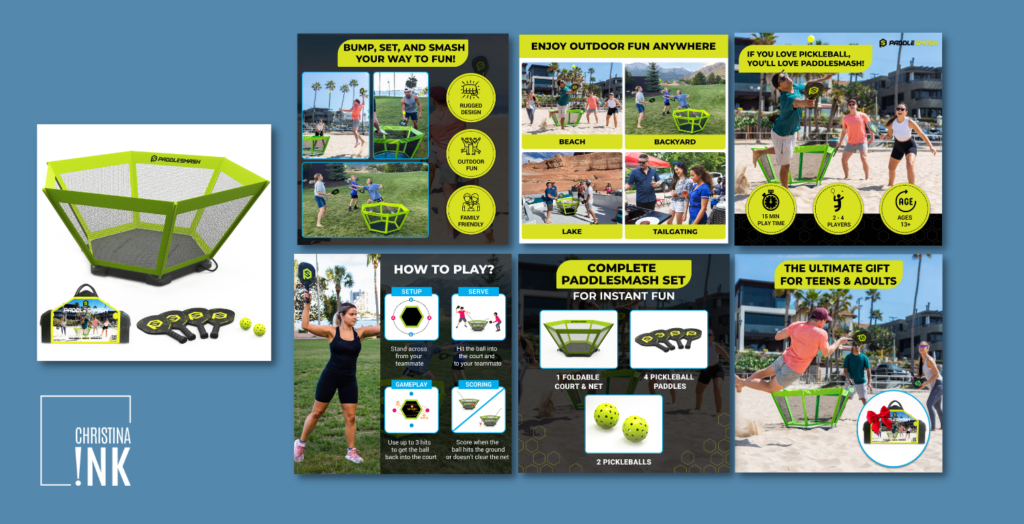
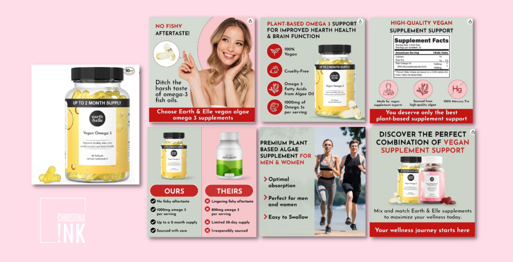
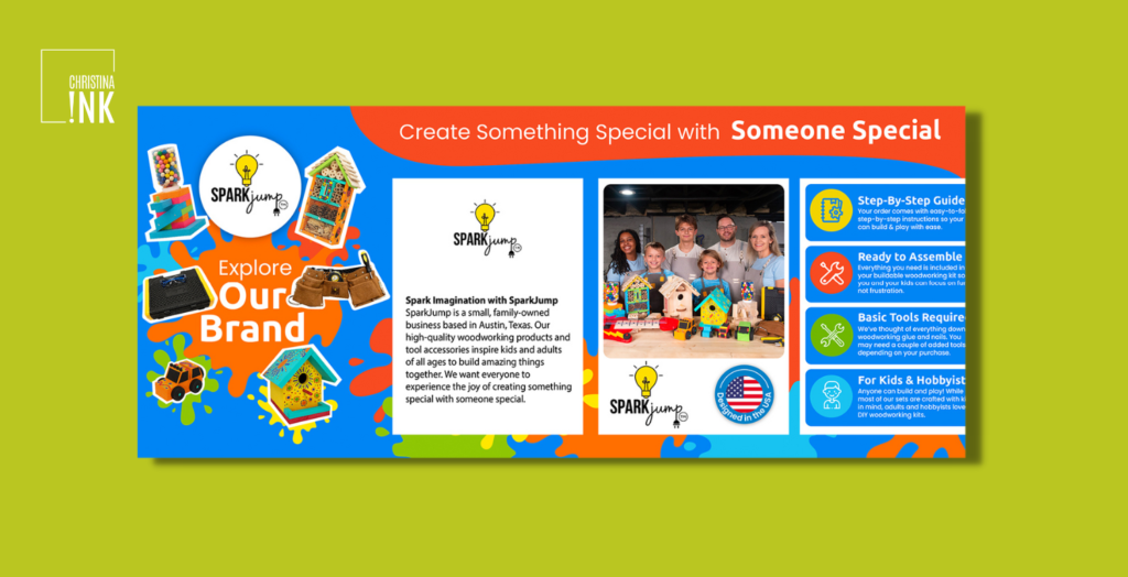
Need some help? Amazon graphic design is our speciality. Check out our portfolio to see how we helped brands like PaddleSmash, Sparkjump and Inspiration Play reach the top of search and boost sales. Contact us today for a quote to optimize your Amazon graphic design today. Use code CHRISTINAINK10 to save 10% on your first order.


LIKE THIS ARTICLE?