Amazon A+ Content isn’t just about elevating your product descriptions; it’s about creating an immersive experience that resonates, captivates, and converts. It’s that extra layer of storytelling and engagement that transforms casual browsers into committed buyers. It’s also a way to expand your real estate on Amazon and show shoppers and competitors who is boss.
Whether you’re a seasoned seller looking to revamp your listings or a newcomer eager to make a splash, get ready to unlock the A+ Content where words meet images, where storytelling meets salesmanship, and where your brand finds its voice amidst the digital aisles of Amazon.
Is Amazon A+ Content Worth It?

One of the key advantages of A+ Content is its potential to increase conversion rates. According to an Amazon case study on a brand’s experience with A+ Content, they witnessed a 6% increase in sales conversions after implementing enhanced content strategies. This increase in conversion demonstrates how the additional visual and informational elements of A+ Content can engage customers and drive sales.
What is Amazon A+ Content?
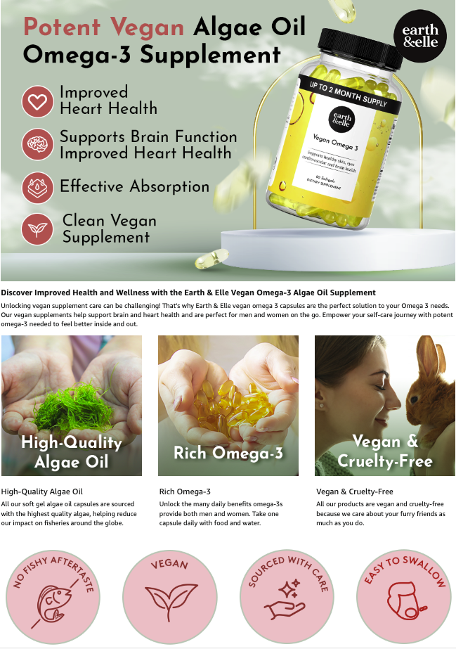
Fig 1.0: Sample Amazon A+ Content (3 Modules)
Imagine your typical product description receiving a magical upgrade, transforming it into a visually captivating storytelling masterpiece. This is where Amazon A+ Content steps in, revolutionizing how you present your products across the Amazon marketplace. Through carefully curated visuals, compelling text, and strategic layouts, A+ Content offers a unique opportunity to make your products stand out in the crowded digital marketplace. You can incorporate attention-grabbing imagery, detailed product features, and even videos that showcase your product in action. Choose from 7 modules to captivate and stop the scroll.
One of the key advantages of Amazon A+ Content lies in its ability to tell your brand’s story. Beyond just listing features and benefits, A+ Content gives you the space to narrate the journey behind your product. You can delve into the inspiration, innovation, and craftsmanship that define your brand’s ethos. This storytelling aspect doesn’t just create a connection—it forges a bond between you and your potential customers. The detailed and immersive presentation fosters a sense of credibility and transparency. By providing a deeper look into your products, you empower customers to make informed choices, leading to higher conversion rates.
Whether you’re launching a new product line, aiming to revamp your existing listings, or striving to amplify your brand’s online presence, Amazon EBC (A+ Content) is your creative ally. It’s the tool that lets you break free from the mundane and paint your brand’s masterpiece on the canvas of digital retail. In the next section, we’ll unravel the steps to create awe-inspiring A+ Content that captivates your audience and drives sales.
Where Can I Find The A+ Content Section?
A+ Content is featured beneath the Product Description segment within a product’s detailed page. You’ll notice the Amazon Brand Story just above the A+ section for those sellers who have chosen to leverage it. Both replace the standard written product description on the front end.
How Much Does It Cost To Leverage Amazon A+ Content?
The service itself, so long as you qualify to access it, is free. Crafting A+ Content, however, takes time and money, so it’s a good idea to first decide your budget. Trying to DIY Amazon A+ Content can lead to poor graphics, inconsistent branding, confusing copywriting, and a mirage of other issues that can decrease clicks and sales. Many Amazon listing optimization agencies offer A+ Content optimization, so its essential to ensure you do your due diligence before hiring. Some agencies charge exorbitant fees, while others do not deliver high-quality results.
How Do You Create A+ Content?
Let’s explore the step-by-step process Christina Ink leverages required to create and upload your A+ Content.
Step 1: Verify Eligibility – Ensure you meet Amazon’s eligibility requirements to access A+ Content. Generally, brand-registered sellers or vendors are eligible.
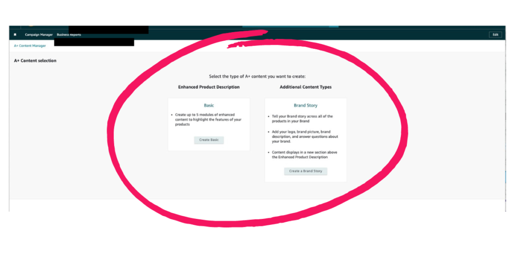
Step 2: Access A+ Content Manager – Log in to your Amazon Seller Central account. From the Advertising drop-down menu, select “A+ Content Manager” (for sellers) or “Amazon A+ (A Plus) Content” (for vendors). Choose the content type: Enhanced Product Description or Additional Content Type.
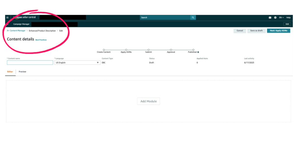
Step 3: Create Content Details & Choose a Product – Name your A+ Content before selecting the product for which you want to create A+ Content.
Step 4: Choose a Module Layout – Amazon offers various module layouts such as Comparison, Standard, Side-by-Side, etc. Choose a layout that suits your content type.
Step 5: Add Modules – Insert different modules like images, titles, descriptions, charts, and videos. These modules can effectively highlight your product’s features and benefits.
Step 6: Upload Images and Media – Upload high-quality images and videos that showcase your product. Images should adhere to Amazon’s image guidelines.
Step 7: Craft Engaging Text – Write compelling and concise copy that explains the product’s unique features, benefits, and uses. Focus on customer needs and pain points. Ensure to add bold headlines and alt text to help boost customer engagement and visibility.
Step 8: Preview and Edit – Review your A+ Content using the preview feature. Edit and refine your content for clarity and visual appeal. Never publish your A+ Content without reviewing it first. Mistakes can turn shoppers away as they may question the validity of your brand.
Step 9: Submit for Review – Once you’re satisfied with your content, submit it for Amazon’s review. They will ensure your content meets their guidelines and policies.
Here Are The Steps to Setup A+ Content In Your Backend:
Step 1: Brand Registry (For Sellers) – Ensure your brand is registered on Amazon Brand Registry. This gives you access to A+ Content features.
Step 2: Vendor Central Account (For Vendors) – As a vendor, set up your account on Amazon Vendor Central and navigate to the A+ Content Manager section.
Step 3: ASIN Selection – (Both Sellers and Vendors) Choose the ASIN (Amazon Standard Identification Number) for which you want to create A+ Content.
Step 4: Content Approval – After review, Amazon will either approve your content or provide feedback for necessary changes.
Step 5: Live Display – Once approved, your A+ Content will be visible on the product detail page under the Product Description section. It’s common at this stage for Amazon to carefully review your content, which may cause processing delays. If they notice issues with your brand name or content at large, they may not approve your publishing request. This is also why it’s important to work with an Amazon listing optimization agency that understands Amazon’s code of conduct to diminish any issues at publishing.
What Is An Example Of Conversion Worthy A+ Content?

Let’s review a recent client, PaddleSmash, to understand the criteria for conversion-worthy Amazon A+ Content.
#1 Visuals That Spark Desire: They say a picture is worth a thousand words, but in the realm of e-commerce, it could also be worth a thousand conversions. PaddleSmash’s Amazon A+ Content harnesses the power of striking visuals that not only showcase products but inspire desire.
High-definition images and graphics bring products to life, allowing customers to envision themselves utilizing the gear in real-life scenarios. But before getting to this stage PaddleSmash understood the assignment, craft striking product photography that leverages both lifestyle and product photography as an avenue towards A+ Content success. Whether it’s the main banner showcasing the summer’s hottest and trending outdoor game or the step-by-step How to Play section, the product photography within PaddleSmash’s A+ Content is a catalyst for converting casual browsers into committed buyers.
#2 Building Trust through Comprehensive Information: Transparency and trust are the cornerstones of successful online retail. PaddleSmash’s Amazon A+ Content goes beyond the basics, providing customers with comprehensive information that empowers their purchase decisions. Detailed specifications, usage scenarios, and even step-by-step instructions foster a sense of confidence that the product is the perfect fit for Amazon shopper’s needs. In a digital landscape where skepticism can be high, offering in-depth insights through A+ Content bridges the gap, creating a stronger bond and ultimately leading to higher conversions.
#3 Persuasive Copywriting: While most brands stick to me-too copy on Amazon, Christina Ink employs a creative concept in getting brands noticed. PaddleSmash was no exception. By articulating the brand’s biggest benefits, what’s included, step-by-step game instructions, bold headlines, and balanced writing to graphics, Christina Ink fosters a compelling narrative customers can trust.
Navigating Amazon’s Basic A+ Content Modules
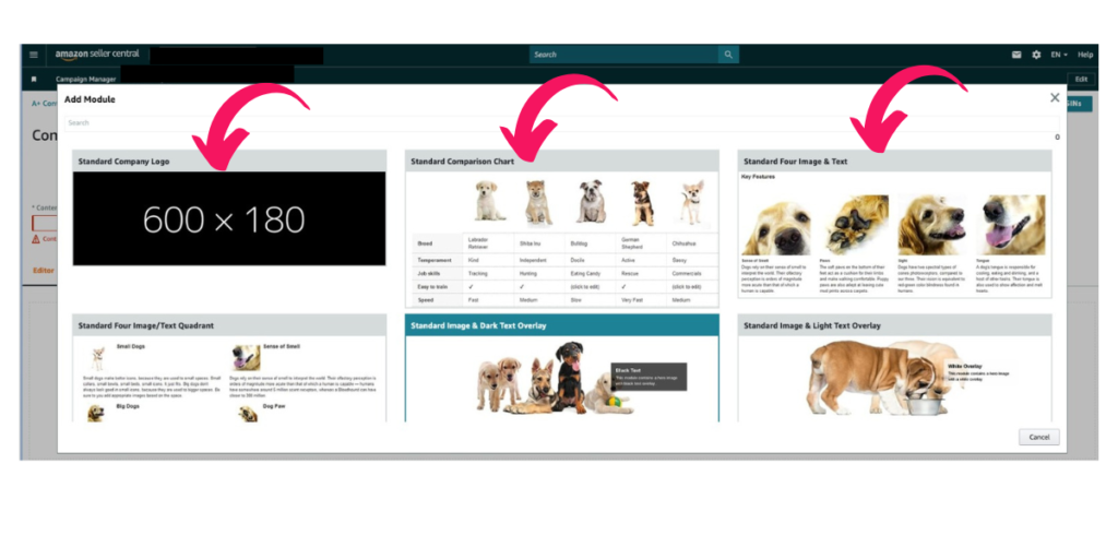
Let’s delve into each of the A+ modules, building blocks for shaping engaging stories and providing essential information to potential buyers.
Standard Company Logo: Kickstart your A+ Content with brand recognition. The Standard Company Logo module lets you prominently display your logo, reinforcing brand identity and creating a consistent visual experience for shoppers.
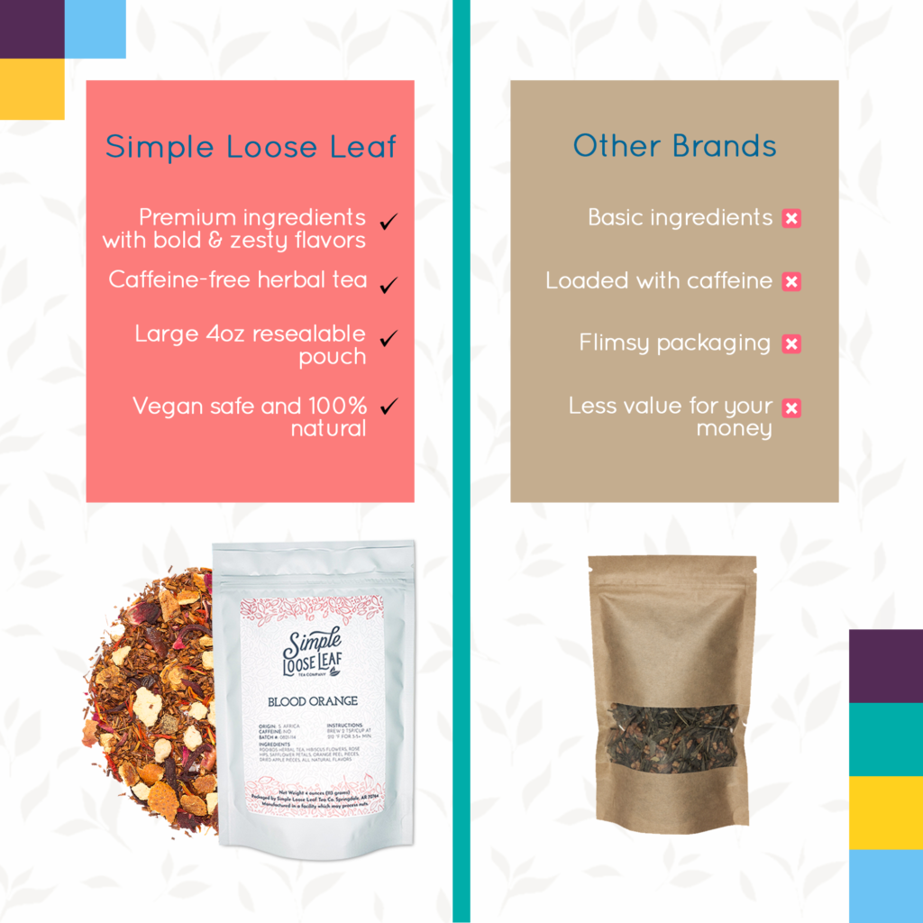
Standard Comparison Chart: Clear and concise, the Standard Comparison Chart module allows side-by-side feature comparisons. This module empowers customers to make informed decisions quickly, especially when choosing between similar products.
Standard Four Images and Text: The Standard Four Images and Text module enables the presentation of multiple images alongside text. It’s perfect for showcasing a product’s diverse features, benefits, and use cases, offering shoppers a well-rounded view.
Standard Four Images/Text Quadrant: Divide and conquer with the Standard Four Images/Text Quadrant module. It creates a visually engaging grid, each quadrant accommodating images and corresponding text. Showcase versatility or nuances in a visually appealing format.
Standard Image and Light Text Overlay: Harness the power of visuals and text with the Standard Image and Light Text Overlay module. Overlay light text on a captivating image to convey messages, benefits, or calls to action seamlessly.
Standard Image and Dark Text Overlay: For dramatic impact, choose the Standard Image and Dark Text Overlay module. Overlay dark text on an image to create bold contrasts, drawing attention to key features or conveying essential information.
Standard Single Image and Highlights: The Standard Single Image and Highlights module focuses on the visual allure of a single image complemented by highlighted text. This combination effectively emphasizes specific product attributes or benefits.
Standard Image Header with Text: Create an impactful entrance with the Standard Image Header with Text module. It introduces your content with a striking header image, setting the tone for the compelling information that follows.
Standard Multiple Image Module A: Showcase your product’s versatility with the Standard Multiple Image Module A. It allows you to present a series of images that highlight different angles, use cases, or features, giving shoppers a comprehensive visual experience.
Standard Single Image and Sidebar: The Standard Single Image and Sidebar module enables you to pair a captivating image with a text-rich sidebar. This layout is ideal for providing detailed explanations, benefits, or customer reviews.
Standard Single Left Image: Balance is key, and the Standard Single Left Image module ensures the spotlight remains on your product. Place a single captivating image on the left, keeping the focus on its visual appeal.
Standard Single Right Image: Alternatively, shift the spotlight to the right with the Standard Single Right Image module. A captivating image on the right complements your content and product details.
Standard Product Description Text: Present your product’s core information effectively with the Standard Product Description Text module. This space is dedicated to providing detailed descriptions and specifications, catering to the customers’ thirst for information.
Standard Technical Specifications: Display intricate product specifications in an organized format, offering customers in-depth insights.
Standard Three Images and Text: Strike a balance between visual engagement and informative text with the Standard Three Images and Text module. Display three images alongside accompanying text, creating a comprehensive narrative.
Amazon’s A+ Content modules offer endless creative possibilities for Amazon sellers. By strategically integrating these modules and enlisting creative graphic design, sellers can craft dynamic product listings that engage, educate, and inspire shoppers.
The Do’s & Don’t Of Amazon EBC (A+ Content)
DO
Master The First Banner: You’ve got seconds to stop the scroll in your A+ Content, and every millisecond counts. Captivate your audience with a compelling first banner that includes an open-loop hook to pique curiosity and keep shoppers on page longer.
📷 Respect Copyrights: Share only content you own the rights to – images, videos, and text – to avoid potential legal issues. Be mindful of the type of stock images your graphic design or Amazon listing optimization agency leverages. Reminder: When you exit your Amazon brand, legal teams will also be looking for compliance with Amazon’s code of conduct from the time you began selling on the platform. Your A+ Content needs to respect copyright laws so you can maintain legal authority over your brand and satisfy trust with potential brand buyers in the long term
📐 Pay Attention to Specifics: Ensure your images match Amazon A+ Content’s required image sizes and resolution for a polished presentation. Failure to do so means Amazon may reject your upload costing you timely delays.
🖼️ Optimize Thumbnails: Choose PNG or JPEG formats and maintain a 16:9 aspect ratio for eye-catching thumbnail images. A tip is to ensure your graphic design team relents source files so you can make easy changes to graphics down the road without re-hiring someone to recreate a select few images
📈 Leverage Brand Stamps: A hack is to create a logo banner that highlights your brand’s biggest selling features. The banner should house 4-5 feature brand stamps. Avoid using individual squares because squares stack one on top of the other on mobile devices. Your A+ Content will be difficult to scan and shop via the mobile view if you leverage squares for this section.
💬 Craft Captivating Storytelling: Draw visitors in with an original and compelling story that engages your audience to learn more. Maintain your brand theme throughout your fonts, and draw attention to module headlines using bold text. Copywriting needs to be persuasive, but it also needs to be well-balanced so shoppers can quickly take what they need from your visuals and module captions to make a purchase decision. *Don’t forget to optimize your copy for the mobile view.
🎥 Opt for Video Content with Customized Graphics: Upload videos and images in supported formats like MOV, MP4, and MPEG-2 for a captivating and seamless experience. Keep videos under 45 seconds or less so that your content is not inadvertently shortened by Amazon. Graphics should be customized for your brand but also offer a unique experience for shoppers. Get creative.
📊 Ours Vs. Theirs Charts: Comparison charts are the perfect way to highlight why your product is the superior choice against your competitors. Quell shopper doubt immediately in both your Amazon Images and A+ Content so shoppers can make the right choice, and add to cart your transformational offer.
🔎 Implement SEO: While there is still debate on the effectiveness of adding SEO to your images, it’s also one of the best ways to tell shoppers exactly what your product is and does. Use your main keyword in at least two banners, and add alt text to the applicable backend. Did you know? Google can index both text and images within your A+ Content. A few keywords aren’t such a bad idea.
DON’T
📫 Ignore Amazon’s Code of Conduct: Don’t include contact or shipping details, trigger words, satisfaction guarantees, or more that are against the code of conduct for the platform. No matter how appealing black hat tactics may be, you set your brand up for costly errors that could end your time on Amazon when you choose this route.
🚫 Leverage Symbols & Trademarked Terms: Did you know the word velcro is a copyright word? That’s right, knowing what to say in any section of the Amazon listing is key to your success, the A+ section included. Skip copyright, trademark, or registered terms and symbols to ensure a clean and compliant presentation.
📸 Publish Text Heavy Images: It’s natural to want to tell shoppers how great you are, but text-heavy images are distracting. Great graphic design is about balance. Your A+ Content needs to capture the perfect balance between stunning visuals and persuasive copy. Less text in each image is more.
🗣 Share Heavy Promotional Content: Steer clear of overused promotional phrases like “best-selling” or “the best,” as these terms are not compliant on Amazon and also come across as sleazy sales tactics. Build trust and offer a unique brand story so customers naturally choose you over competitors.
🔗 Post External Links: Amazon wants to retain its traffic, and rightfully so. Do not direct shoppers away from the platform, or you risk suspension. The goal is to keep the attention on your Amazon listing, not drive people away from it.
📸 Don’t Skip High-Quality Product Photography: Too many times, Amazon sellers come to us thinking they’ve nailed their product photography when in fact, they’ve taken the DIY approach or paid for costly photography with lacklustre results. If you’re unsure about the type of product photography ideal for A+ Content, ask. Don’t use the same product photo twice in your A+ Content, as customers may be confused by the message you are attempting to convey.
Amazon A+ Content Helps You Stand Out
Now understand the transformative power of A+ Content – how it transcends traditional product listings to become an immersive experience that resonates with shoppers. By creating compelling narratives, showcasing product features, and fostering brand engagement, A+ Content empowers you to shape your brand’s story in a way that’s both captivating and persuasive.
Christina Ink is your strategic partner on the journey to Amazon success. Our dedicated team understands the intricate nuances of A+ Content and harnesses it as a potent tool to enhance your listings. We bring your brand to life, infusing it with a unique brand story through stunning visuals and creative copywriting that resonates deeply with your target audience. Contact us today and witness how we can turn your A+ Content into a gateway for your increased sales and engagement on Amazon.


LIKE THIS ARTICLE?